Mission Collaborative
Assessed the client’s current website and proposed a website redesign based on pain points
Duration
Two weeks
Role
Usability Tester, Service Designer
Tools
Adobe XD, Sketch, Miro
Overview
Mission Collaborative was founded in 2017 with a simple mission: assist and encourage working professionals unsatisfied with their careers and switch to a new career. Our clients created the “Career Design Process” to expose new users to career options and create a blueprint towards a successful and new career.
Scope: Evaluate effectiveness and accessibility of Mission Collaborative’s current website and online learning platform. Recommend ways to improve touch points over the course of two weeks.
Research Process
As someone who was going through a career transition, this project hit close to home. I knew the frustrations and remembered the questions I had when deciding to leave my corporate job. This experience helped my teammates and I create a screener survey about career transition and feelings about online learning platforms. We posted our short survey onto Facebook, Reddit, LinkedIn, and reached out to friends.
Questions included:
Are you happy with your current career/job situation?
Have you considered making a career change in the past 3 months?
Have you ever made a career change?
*We included the option for participants to leave their phone number or email for a second interview.
We heard back from 81 participants and conducted further interviews with 15 participants.
The follow up interviews helped us identify why individuals made/are considering a career change, and what individuals are looking for in their next career.
What we found from our interviews were:
Dataset from the Client
In addition to our own research, the client provided us with a dataset from their most recent cohort. The dataset provided detailed information on participants, including:
Salary range
Age range
Motivations for making a career change
Likes/dislikes of MC’s service
Although no one on my team was an expert data analyst, we did our best to review and identify trends in the large dataset.
We found our findings from the interviews corresponded with those from the dataset. The top three similarities were:
Feeling unsatisfied with current career
A desire to pursue their passions
Change financial status
Additionally, we learned busy working professionals want a simple yet accessible way to explore and discover their true career goals.
*This is also addressed in the accessibility section below.
Personas + Journey Maps
We used our interviews to create four personas, and used the data from the dataset to create their journey maps. This helped the clients understand the mindset future users are sure to have and fix the pain points current users have faced.
Sally McPherson represents people who are close to retirement but are curious about other options available.
Rebecca Williams represents people who have a high job title and earn an average salary. She is constantly stressed and wants to pursue her passions.
Lewis Sullivan represents the younger crowd who earns a lower salary range. He wants to earn more money, so wants to explore more lucrative career options.
Mark Thompson represents the high salary man who wants to spend more time with his family.
The commonalities between the four journey maps are:
Difficulty maintaining work-life balance
Felt overwhelmed by the number of platforms
Frustrated by lack of communication with instructors
Disliked and overwhelmed by organization of information on website and portal
Design Process
Although all of our user research focused on user’s motivations related to career transition, our usability tests highlighted many issues with Mission Collaborative’s website and e-learning portal. In particular, participants found the website too wordy and too lengthy. Additionally the website not WCAG 2.0 accessible, which is important to the clients.
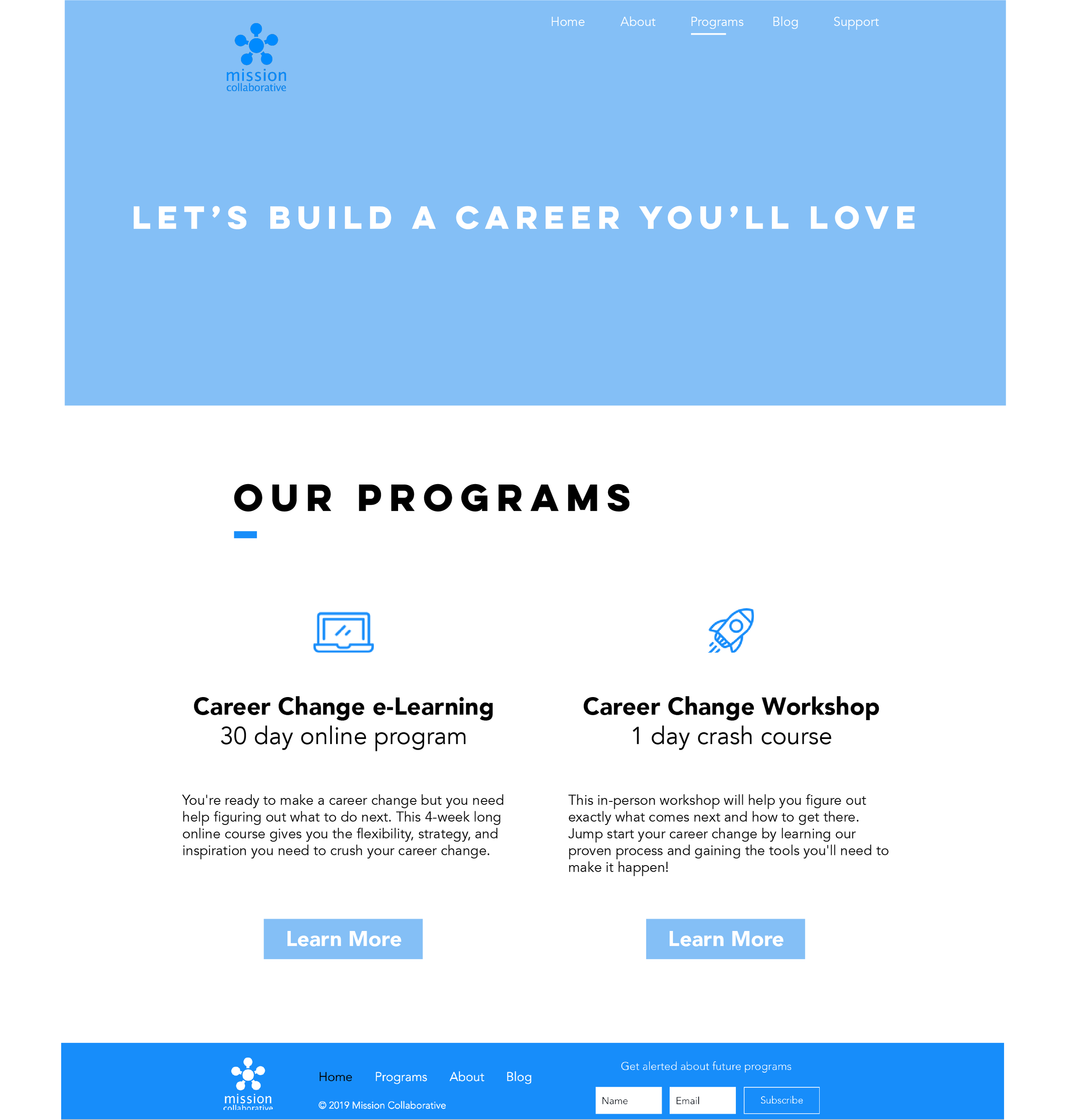
With this in mind, we decided to focus on redesigning the main touch point, the website; since this is what a user will see first. Our redesigns focused on making the website more accessible and simplified.
We started by redesigning the information architecture:
Original information architecture
Revamped information architecture
What did we change?
Shorten each page by removing repetitive blocks of text
Reorganize text hierarchy, placing important information at the top
Renamed “Bootcamp” to “Workshop” and “Fellowship” to “E-learning” to avoid confusion in interpretation
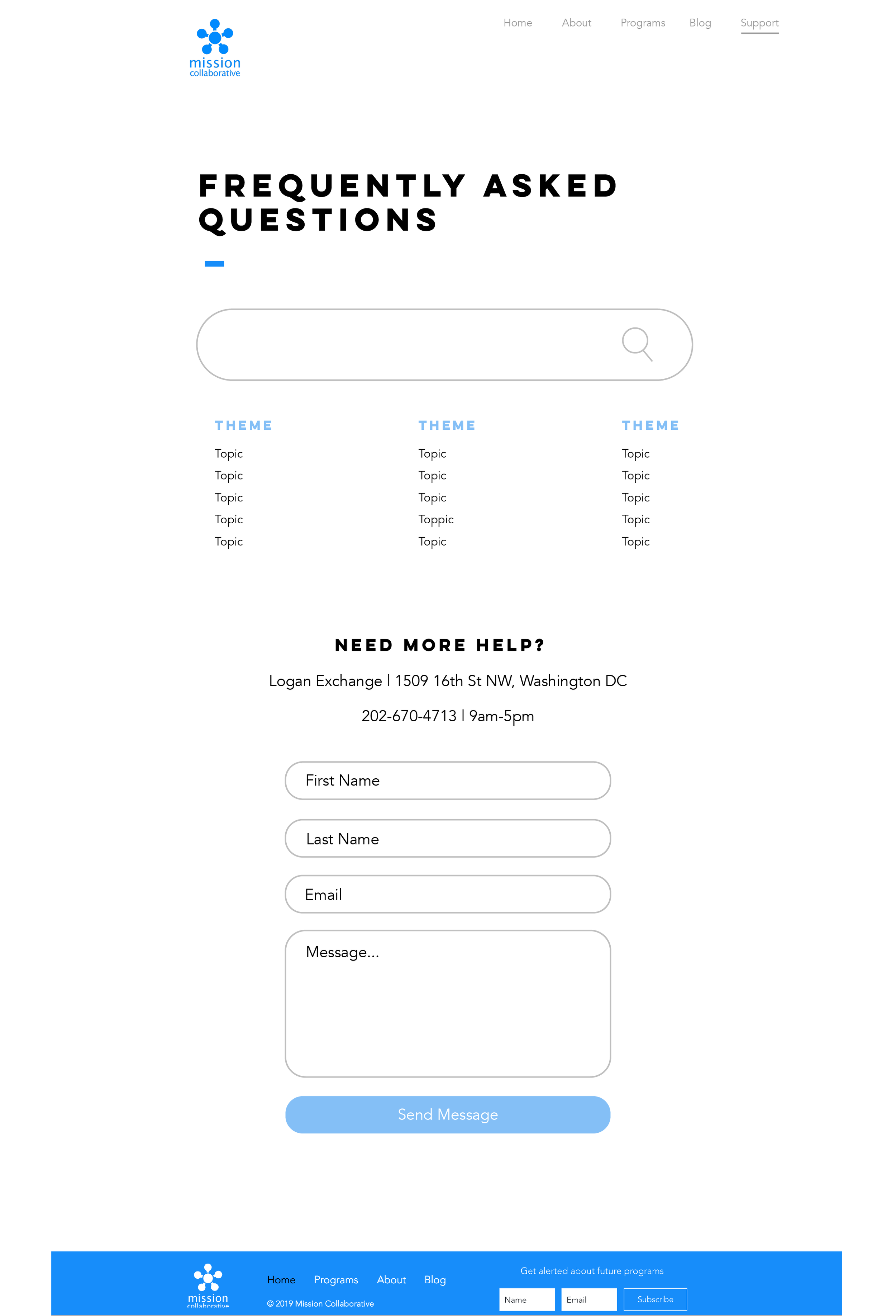
Create a separate FAQ page rather than having it at the bottom of the Fellowship page
Added a search bar on the Blog page, for easy access to articles.
All of these changes were based on feedback we received during the usability tests. Using these ideas I sketched several iterations of the new website, below is one example.
Final Designs
We used Adobe XD to turn the original website (shown below) into a cleaner and simplified version, making sure there was enough white space to relieve stress on the eyes.
Additional Research and Recommendations
We wanted to redesign Teachable (e-learning platform) because the usability tests confirmed the modules were too long and had large blocks of text. Additionally the usability test participants thought the side navigation was overwhelming since it displayed the entire curriculum at once.
However, we quickly found these problems cannot be solved since Teachable limits what you can customize. Therefore, we conducted a comparative analysis of two different platforms that should be considered.
These two platforms were chosen, since they were recommended by GetApp.com. They have similarities to Teachable, but each have a unique feature not offered by Teachable.
All platforms are web-based
Northpass and Thinkific are transparent with their price
Northpass allows the curriculum to be split into pages — this would help break up large chunks of text so it is easier to digest
Thinkific has more customization options — offers HTML editor and JavaScript editor
Thinkific also has an automated check-in option — instructors can send encouraging notifications to their students
Accessibility
The last part of the project was to assess the accessibility of the website, to ensure it meets WCAG 2.0 levels of accessibility. This includes color contrast, text size, transcripts for videos, and much more.
From our findings, we found that currently none of the pages on Mission Collaborative’s website meet this standard. Luckily, there are some easy fixes to help the website reach at least the A level of compliance.
Provide transcripts for all videos on website
Include <alt tags> for all images and gifs on website/e-learning
Ensure active links can be differentiated from inactive links some other way besides color changes
Add more color contrast across the website/e-learning pages
Improve visual hierarchy across all pages
Break up large chunks of text
Recommendations and Suggestions
We provided the client with short term and long term recommendations they can easily follow.
The short term recommendations are focused on the website and updating it to be more current and WCAG compliant.
The long term recommendations include suggestions to create partnerships to further improve their process.


